Reach your website goals faster
Small businesses, ecommerce/retail, digital agencies, and education companies have been flocking to us since 2005.
Find out why!
Free 30 day trial • Cancel anytime
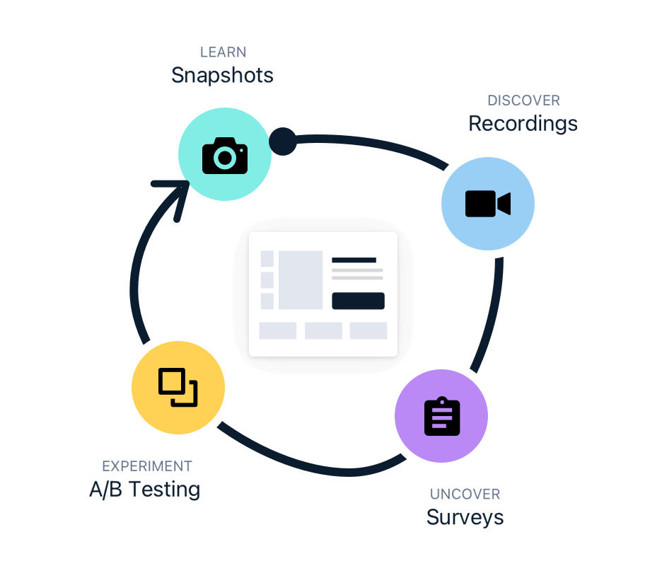
Whether your goal is to increase sales, subscriptions, or get more pageviews, our website optimization tools can help you get there.
Heatmaps, Scrollmaps
& Click Reports
Our customers say
“A super tool to see how visitors interact on your website!”
Get rid of best practices, opinions, and design guesswork. Our heatmaps, scrollmaps, and other visual reports will show you exactly how your customers are responding to elements on your site.

With the power of Crazy Egg's heatmapping tools, you can:
-

Add an extra layer of insights to your Google Analytics data
-
Drill down to how your email and ad campaign visitors are behaving on-site
-
Make sure your CTAs are being seen
-
Place content in the order of importance to your customers
-
Track what’s going on behind pop up forms or login screens
-
Set a website or page redesign project up for success.
Crazy Egg customer Radio Free Europe uses heatmaps to boost content engagement and placement on their homepage.
“The best way to see what visitors are doing on your website.”
Free 30 day trial • Cancel anytime
Website Recordings
Our customers say
“Does exactly what I need it to do, with no hassle.”
Crazy Egg records the entire user session. Understand general patterns of how people browse your site, or investigate a particular point in the buyer’s journey where people are dropping off.

With Recordings, you have the ability to:
-
Identify areas of customer frustration, like form glitches or confusing navigation
-
See in real time how people are interacting with your product or checkout pages
-
Dive into particular audience segments like New, Mobile, or Most Active visitor
-
Filter by source (like Google)
Crazy Egg customer Intuit uses visitor insights from Recordings to figure out what design changes need to be made.
A/B Testing Tool
Our customers say
“We’ve been able to make some significant UX improvements with the insights from the heatmaps, screen recordings, and A/B testing”

TIP: Put your Heatmaps and Recordings observations into action and minimize any risk!
Our A/B Test interface makes it super simple to:
-
Pick a goal
-
Map a desired website action to that goal
-
Watch the results come rolling in
As soon as we detect a winning variant, we'll send more traffic to that winner automatically. This gives you as many conversions as possible without having to waste any traffic.
Crazy Egg customer WallMonkeys saw a 550% increase in their conversion rate when they A/B tested their homepage.
Our customers say
“Just give it a try - they offer a free trial and it's incredibly easy to install the code on your site. Depending on how many pages you want to track, setup could take five minutes or less.”
More ways Crazy Egg helps to improve your website
Errors Tracking
Are website errors causing frustration in your website visitors? Our error reports can tell you where errors are occurring, and who is being most impacted.
Learn moreSurveys
Ask your customers and website visitors targeted questions and get valuable insights in real-time.
Learn more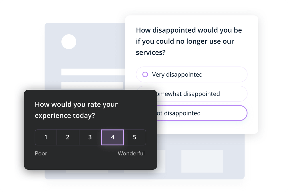
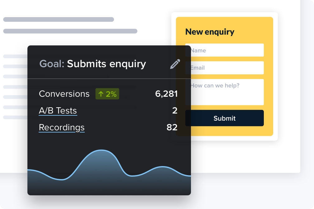
Goals
Tell us your goal and we will measure and help you enhance your website performance.
Learn moreCTAs
Maximize Conversions and Drive Results: Unleash the Power of CTAs (Call to Action) Features for Your Website.
Learn more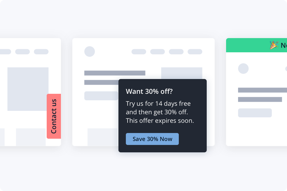
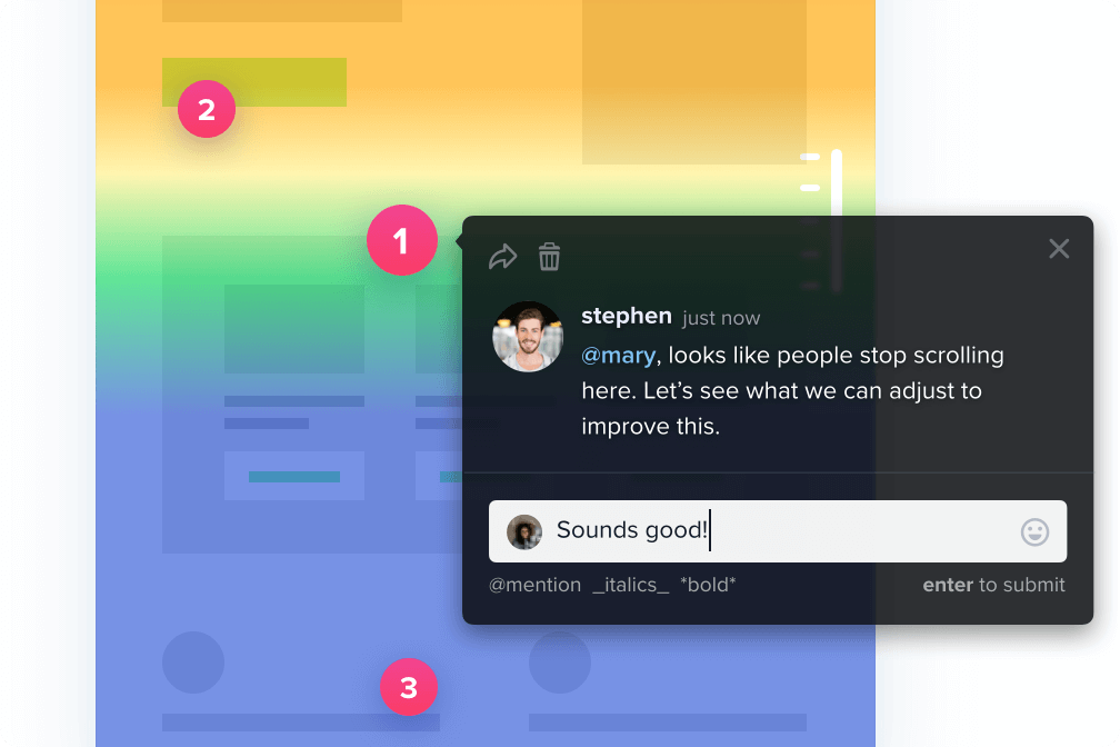
Commenting
Collaborate directly with your team and clients.
Discuss ideas to improve website performance in Snapshot reports and Recordings so conversations stay contextual and relevant.
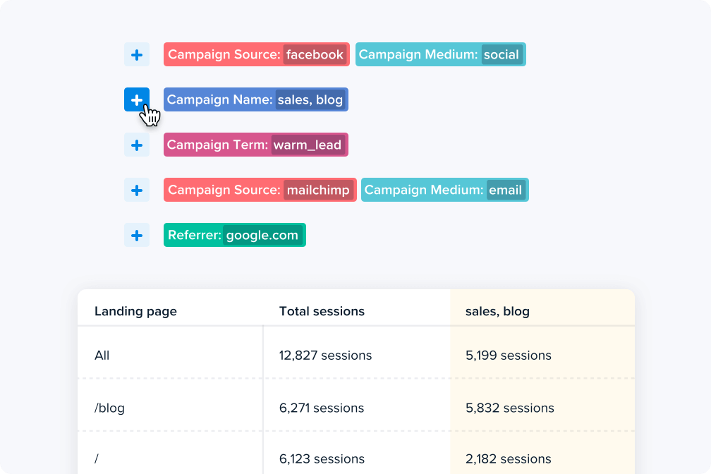
Traffic Analysis
Compare the performance of referring traffic, campaigns, and landing pages against each other.
Generate interactive heatmaps from these sources to gain deeper insights on behavior based on traffic source.
Learn more